


5 Mobile SEO Tips for Ecommerce Sites
According to Insider Intelligence, mCommerce will reach $620.97 billion in 2024, accounting for 42.9% of all eCommerce. And the number of orders via smartphones will continue to grow in the future. For example, the US alone will see a 4-time increase in mCommerce from $128.4 billion in 2019 to $553.28 billion through 2024.
Therefore, if you want to draw users’ attention to the eCommerce store and make them loyal customers, invest in enhancing your site’s cross-device performance and mobile search engine optimization (SEO).
This term refers to the process of improving a site so that it ranks better in SERP (search engine results pages) and therefore brings in more smartphone users.

How to start the process of mobile SEO-optimization
Where do you start the process of eCommerce mobile SEO optimization, and what are the main points to consider? Read on to learn five crucial mobile SEO tips on achieving mobile-friendliness.
1. Make navigation easy and clear
What do you need to consider, providing a user-friendly experience? Intuitive and simple eCommerce navigation UX is essential. After all, if the user can’t easily navigate through the pages, they’re likely to leave the site. That’s why it’s worth making sure that visitors have no trouble navigating the mobile version of your website.

Creating a hamburger menu is a convenient way to make your site easier to navigate when viewed from mobile devices. It is a button with three horizontal lines, usually placed at the top of the page in the menu bar. When you click on this button, a handy site structure menu pops up, from which the user can quickly go to the page he wants.
A clear hierarchy of pages is also crucial for SEO. Therefore, it is worth implementing so-called breadcrumbs (the path to the page on which the user is now). Thanks to this, it’ll be more convenient for visitors to use the site.
2. Implement a responsive design
Responsive design is another important part of a mobile-friendly website. It makes sure that the site will display correctly on any device (smartphone, tablet, etc.).
Implementing responsive design provides visitors of your online retail site with the comfort of use. It makes it easy for them to browse the pages, use the search, add items to the cart, and place orders.
Suppose they do not adapt your site for mobile devices. It will look chaotic when viewing the desktop version from a smartphone, and it will be uncomfortable to browse. Therefore, the conversion rate on your eCommerce site will be low.
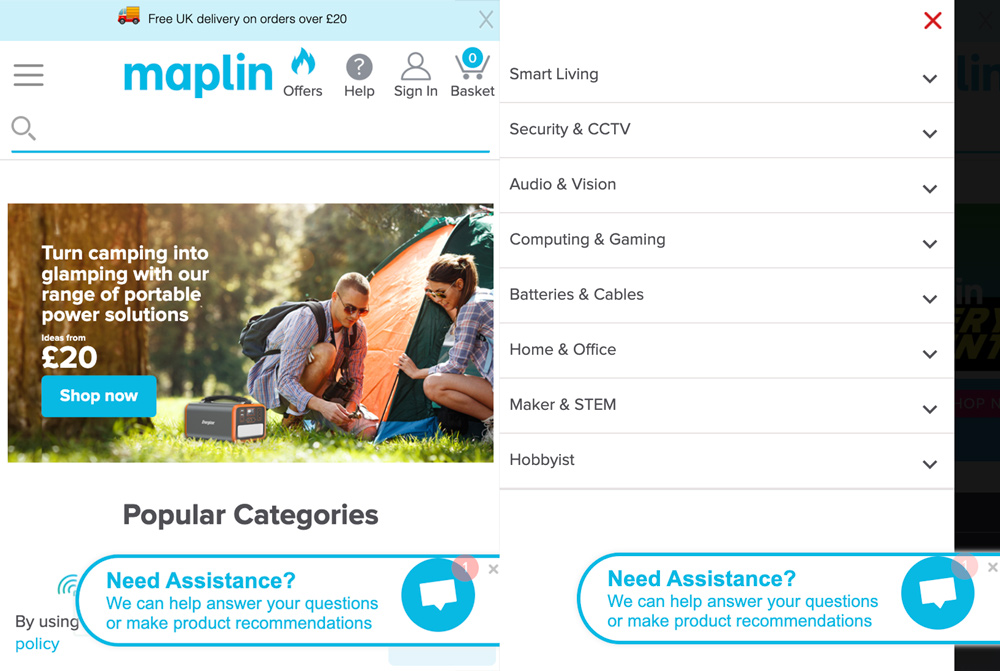
As an example of responsive design, see the mobile version of the Maplin website. The menu and search bar are nicely designed. On the right side of the screen, there is a “Need Help” pop-up that doesn’t interfere with the page view. In addition, there is a section “Popular Categories” with a swipe for easy navigation. Plus, the size of the banner is optimal for perception.
3. Provide a positive user experience
Responsive design is one of the essential mobile SEO tips since it influences a positive user experience. However, this concept also includes other components that should be considered to ensure your site’s usability. Let’s review some of them in detail.
a) Thumb-friendly design
When developing a mobile version, visitors should feel comfortable scrolling and clicking on elements of the site with their thumb, because that’s how most people surf on smartphones. So make sure that everything is big enough – all the links, buttons, etc.
b) Visible calls to action (CTAs)
CTAs help website visitors take the action you want. When designing a mobile-friendly website, make sure that CTAs stand out on the page and are easy to find. Visitors should see the call to action on the page right away, whether it’s an offer to subscribe to your email newsletter or a button leading to the checkout. In addition, these elements should be easy to click.
4. Use pop-ups carefully
Pop-ups are one of the most effective options to draw users’ attention to the action you want. As a result, many companies use them to increase the conversion rate.
However, these elements are not always displayed correctly on mobile devices. Often pop-ups are not adapted to smartphones and discomfort users. For example, sometimes they occupy the entire screen or half of it. Unadapted pop-ups cannot be closed quickly, and visitors aren’t able to see the information below them. As a result, it may lead to irritated users leaving your site and never coming back.
So pop-ups should be used wisely and optimized for mobile devices. Make sure they don’t hide important information, and users can easily close them if they want to.
A pop-up example from Purplepass.

5. Optimize for Local SEO
When optimizing the mobile SEO of your eCommerce store, it is worth paying attention to local SEO. Because it is from smartphones, users often make queries using phrases like “near me”, “open now”, and similar, seeking a suitable local business.
Therefore, adapting the mobile version for local keywords will help you compete in search results with other companies similar to yours.
Start Optimizing for eCommerce Mobile SEO Today
Mobile SEO is a crucial factor in growing your business. If you want to increase the effectiveness of your online retail site, consider the users who search for your business from their smartphones.
Therefore, using the above-mentioned mobile SEO tips in your optimization strategy will help increase the number of visitors on the site and their conversion into buyers. Use marketing tools to measure your business performance, timely fix issues, and focus on the effective strategies. And that’s how you’ll succeed and increase revenue.

Author: Kate Parish
Kate Parish is the CMO at the web development company Onilab. She has more than eight years of experience in eCommerce Digital Marketing. Kate’s strengths are SEO, branding, SMM, Magento PWA development, and online retail in general.